Ever feel like a design is just… “too much”?
Like everything’s squished together, and it’s hard to know what’s important?
That’s where white space usage comes in.
White space (or negative space) isn’t wasted. It’s the “silent MVP” of design, helping you balance, focus, and pull attention exactly where you want it.
I’m talking about everything from the tiny gaps between text to huge empty blocks on a webpage.
Let’s dive into how white space can make your designs not just look better but work better.
What is White Space?
White space is any blank area in your design.
But don’t let the name fool you—white space doesn’t have to be “white.” It just has to be empty.
Think of it like a breath of fresh air for your layout. It lets each element stand out on its own without crowding the others.
Good use of white space:
- Makes content easier to read.
- Draws eyes exactly where you want them.
- Gives your design a clean, polished feel.
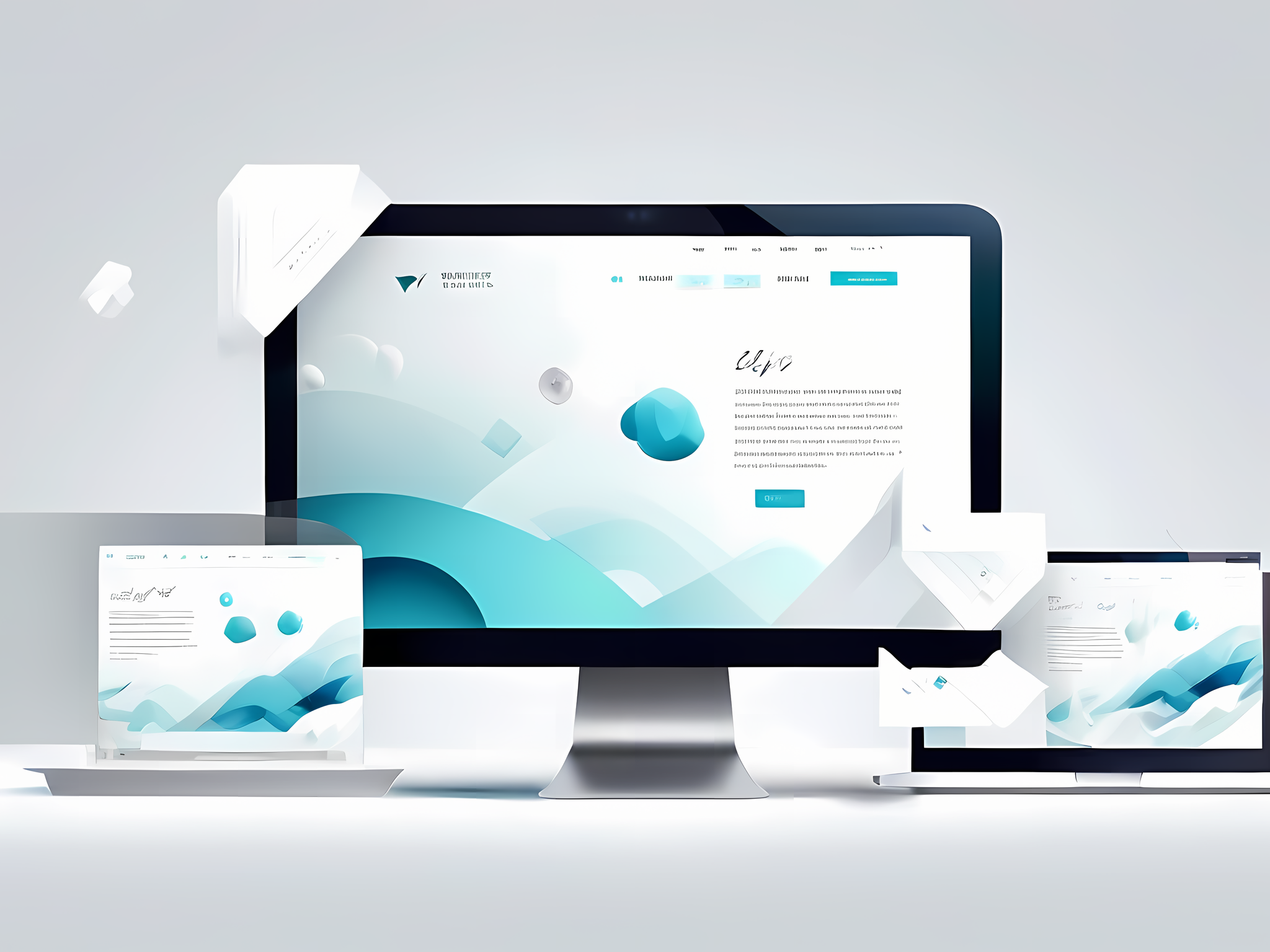
Why White Space Isn’t Wasted Space
Here’s the truth: more content doesn’t mean better results. Cramming everything in one place makes your design messy and confusing. White space helps solve that by letting each element breathe.
1. Improves Readability
Ever see a website where all the text runs together? Hard to read, right?
White space between lines and around text makes it easier to follow. Studies show it even helps readers absorb information better. Google this and you’ll see the same answer over and over: white space boosts comprehension by 20%.
2. Guides Attention Naturally
White space acts like a silent tour guide. It leads your eyes from one area to the next without you even realising it.
Apple nails this with product pages that focus on one element at a time. There’s a reason your eye is instantly drawn to that MacBook or iPhone.
3. Creates a Hierarchy
When you add space around your headings, buttons, and sections, they look organised.
This is what I call the “visual hierarchy.” It’s how you show your audience what matters most without yelling it out loud.
Think of a homepage. You don’t need to say, “Start Here!” if your main button has white space around it. The design itself does the work.
4. Adds Class to Your Design
White space gives a clean, high-end look.
Luxury brands like Chanel or Rolex use tons of white space, letting each item feel exclusive. When you use white space, your design can go from “budget” to “premium” in seconds.
How to Use White Space Like a Pro
Alright, so how do you actually put white space to work?
Here’s the playbook:
- Padding Around Text: Give your lines and paragraphs some room. Even adding 10px around text can make a massive difference in readability.
- Limit Content Blocks: Don’t cram all your info into one section. Split content with white space in between for that clean, easy-to-read layout.
- Use Grids for Balance: White space doesn’t mean random. Use a grid to create consistent spacing across your layout.
- Focus on Mobile: Small screens mean every bit of white space matters more. Give buttons and links enough space so users don’t accidentally hit the wrong thing.
FAQs on White Space Usage
Why does white space make things easier to read?
Because it reduces crowding and gives your eyes a break. People’s attention spans are short, and white space helps make content more “snackable.”
How much white space is too much?
If your design starts to feel empty, you might have gone too far. Aim for balance. Look at luxury websites like Apple or Chanel; they use tons of white space but always have focus points.
Can white space really improve conversions?
Yes! Conversions can jump by 10-30% when you add white space around CTAs. It draws attention right where you want it. Here’s a study on Venngage that explains this further.
Takeaways on White Space Usage
White space might sound basic, but it’s a powerful tool.
From improving readability to guiding focus, it’s a game-changer in any designer’s toolkit.
So, if your design feels cluttered or “too much,” give it some room to breathe.
Your audience—and your conversion rates—will thank you.
Ready to make white space work for you?