Grid Systems and Frameworks in Layout Design? Ever feel like your design could look more professional? Or that something’s “off” but you can’t pinpoint what?
Grid systems fix that.
They bring structure, balance, and clean alignment to layouts.
Think of grids as the secret sauce that takes your design from “okay” to “whoa.”
Let’s walk through what grid systems are, why they matter, and how you can use them in layout design.
What Is a Grid System, Really?
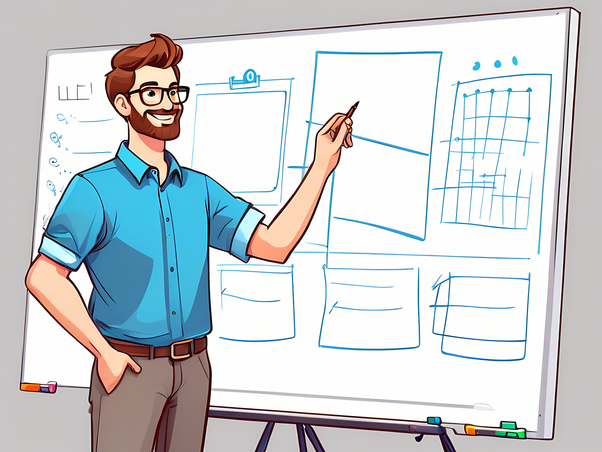
A grid system is a layout tool.
It’s basically a network of intersecting lines that organise content so it’s easy to read and navigate.
Imagine your layout like a city map—each line, each box, is a guide for where everything goes.
From a single-column grid (like a blog post) to more complex multi-column grids, there’s a grid type for every layout need.
Grids make it all feel intentional and keep things visually balanced. And for anyone who’s tried to align text or images by eye alone, you know that balance is hard to achieve without a guide.
Why Use a Grid System?
So, why bother with grids?
Because they save you time, create visual order, and give your designs a more polished look. Here’s what grids do for you:
- Make Layouts Look Clean and Professional: Proper alignment isn’t just about looks—it’s about readability and user experience.
- Save Time: With grids, there’s no more guessing where things should go. Place your content on the grid lines, and it’ll look right.
- Keep Designs Flexible: Need a design that looks good on any device? Grids like the Bootstrap 12-column system make responsive design easier.
Want more on responsive design? Read this guide on basics of responsive design.
Types of Grid Systems You Need to Know
There’s no one-size-fits-all grid. Let’s look at the different types you might use:
- Single-Column Grid: Clean and simple. Great for articles or blog posts where you’re mostly working with text.
- Multi-Column Grid: Perfect for content that needs more structure—like newspapers, web layouts, or catalogues.
- Modular Grid: Think both rows and columns here. This grid style works well for layouts with lots of images or mixed content, like product pages or image galleries.
- Hierarchical Grid: Less strict but powerful. Hierarchical grids organise elements based on importance, which is ideal for web pages with varied content sections.
Why Do Designers Use Grid Frameworks?
Frameworks like Bootstrap and CSS Grid Layout are like plug-and-play grid systems. Instead of building from scratch, these frameworks give you pre-made grid structures that adapt to different devices. That means your design looks good on a desktop, tablet, or phone without much extra work.
Some popular grid frameworks are:
- Bootstrap: Bootstrap uses a 12-column grid that’s flexible and customisable. Designers love it because it’s easy to use and responsive by default.
- CSS Grid Layout: CSS Grid lets you create both rows and columns directly in CSS. It’s built right into CSS, making it versatile for more detailed layouts.
- Foundation: Similar to Bootstrap, Foundation also has a 12-column responsive grid system, and it’s packed with features that make it popular among designers.
Quick Tips for Using Grids Like a Pro
Want to get the most out of your grid system? Here’s how:
- Stick to the Grid: Align everything to your grid. Seriously—grid lines are your friend.
- Use White Space: White space (or “negative space”) keeps things uncluttered and lets your design breathe. Grids help control how you use it.
- Create a Visual Hierarchy: Use your grid to highlight the important stuff—like the main heading or call-to-action buttons. Bigger sections signal importance to the viewer.
- Mix and Match Elements: Grids are flexible. Try combining images, text, and buttons in different grid cells to add variety to your layout. Need tips on pairing grids with typography? Check out Typography Best Practices.
- Think Responsive: Test your design on different screen sizes. A 3-column grid on a desktop might need to collapse to a single column on mobile, so make sure your grid adjusts without breaking.
FAQs
What’s the best grid framework for beginners?
If you’re new to grids, start with Bootstrap. It’s simple, flexible, and has a ton of online resources.
How do grids improve user experience?
Grids make layouts organised and easier to follow. Users can navigate the content naturally, which keeps them engaged longer.
Can I create my own grid?
Absolutely! Start with a basic column structure in your design tool, and go from there. But if you want the process to go faster, a framework like CSS Grid or Bootstrap is your best bet.
Do grids limit creativity?
Not at all. Grids actually free you up to be more creative because they handle the structure, so you can focus on the visuals. They’re more like a guide, not a rulebook.
Wrap Up: Why Grid Systems Matter
Grids take the guesswork out of layout design.
They bring order, make your design look clean, and keep users focused on what matters.
So if you’re not using a grid system yet, it’s time to try one.
Use grids to your advantage, and watch your design go from “meh” to “pro.”